Friday, August 15, 2008
Terrace View Apartment Repaint

Alpenrose!

Monday, August 11, 2008


Friday, August 08, 2008
Hunting Hills Gets New Entrance Signs
 Hunting Hills residents decided it was time for a facelift and recently bought three new entrance signs for their property in Roanoke. The signs are sandblasted Western Red Cedar painted with latex and a special mix of metallic gold and brass one shot to give them that sharp, high-visibility finish. An alternative to 23k gold leaf, the effect is quite dramatic.
Beautiful landscaping (by owners) completes the look. While there are many new materials for signmaking available, wood is still a wonderful choice for signs. In a few years (10-15 depending on sun exposure), the sign will begin to show age, but another coat or two of paint and this sign will look again like it does today. Can't beat wood for longevity and natural beauty.
Monday, July 14, 2008
Dinwiddie Health & Rehabilitation Center

Interestingly enough, I've gotten 2 phone calls now from people looking for this place! (grin!)
So, for those who need to know: the physical address for this facility is:
6405 Boydton Plank Road
Dinwiddie, VA 23803
Thursday, July 03, 2008
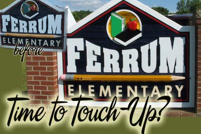
Changing Existing Signs

Friday, June 20, 2008
Thursday, May 29, 2008
Dachshund Sign - We can put anything on a sign
 One of our new (and now one of our favorite) customers wanted a little doggy on his sign...a dachshund. First of all, I had to look up how to spell it to put it on the work order, then we made it! Cute, isn't it?
Wednesday, February 06, 2008
Virginia Military Institute signs
Thursday, January 03, 2008
HAPPY NEW YEAR!
If you peruse our website and cannot find a piece of information you need, please contact us and let us know! We want our site to be as easily accessible and helpful as possible for our customers.
2007 was a great year for Sign Design, and we are looking forward to serving you in '08! Any time you need a sign, please give us a call. Give us a chance to see if we can help you solve your "sign challenge". If we can't do it, we might know who can...we want to be your sign information one-stop shop.
Have a wonderful new year!!
Wednesday, December 26, 2007
Island Peace sign - far out!
Tuesday, December 11, 2007
Monday, November 26, 2007
Roanoke College Pediment
Tuesday, August 28, 2007
Personal sign for customer

Friday, April 13, 2007
Monday, February 12, 2007
We Don't Sell Signs...We Solve Problems

Tuesday, January 30, 2007
We have a New Look!
Wednesday, September 13, 2006
Signmakers are So Misunderstood
“Doctor, I’m sick. I don’t know what’s wrong, and I don’t want you to examine me at all. I don’t want to tell you about any other doctors I’ve seen or what they’ve said. I wanted to feel better yesterday, so that’s your deadline. Now, how much is it going to cost so I can feel better?”
Or, hey, you’re an Architect:
“Mr. Architect, nice office. I am going to have a building constructed, but I’m not sure yet how big I want it or where it’s going to go exactly. Can you draw me up 10 or so designs, let me take a look at them and show them to all my friends and some other architects? Then, I’ll give you a call.”
Or, let’s go all out—you’re a Signmaker:
“Hi. This place looks like a wreck. I’ve never seen so much sawdust and pieces of vinyl laying around. And what is that smell? Is that paint?? Ick! Anyway, I need a sign. I don’t know exactly what I want, what it should read or if I am even allowed to have a sign at my place. How much will that cost? I needed it yesterday, but today will be okay, too. Can you draw me up about 10 ideas and let me look them over, then I’ll take them to 10 other sign shops and see what they would charge. Oh, and why can’t you install it for nothing?”
Sigh…
Sign Design has been in the sign business for over 16 years now, and yep…we’ve heard and seen it all. (Oh, except for that lady who came in and wanted a sign the actual shape of her dog that was dead and buried…that was a new one, even for us.)
Sign making is an art form. It’s a craft. And it’s a business. It’s not a hobby and we’re not selling cans of soup already sitting on shelves.
(Just about) every single sign we make is custom-designed and custom-fabricated for the customer who needs it. That’s the business part.
Talking to the customer, asking questions, deciding what’s the best thing to do—that’s the craft part.
And coming up with the graphic solution that will portray your message in the best way possible—well, that’s the art part.
So, until there is a Doctorate of Signmaking, I don’t think we’ll ever truly be understood. We’re trying to create something from nothing. Take a vague idea and turn it into something tangible and WOW.
And sometimes I don’t think customers really understand how much work goes into doing that.
But, oh well… we will keep asking questions and figuing out possible scenarios and hand-making signs until our little hands fall off. And why? Because we love to do it.
That’s pretty much it…it would just be nice, every now and then, if customers understood us better. Sigh…
Tuesday, June 06, 2006
Tuesday, May 09, 2006
Just a coat of paint...

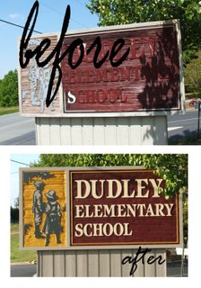
Customers often ask us how long a sand-blasted sign will last, and I tell them this: the paint is the weakest link in the chain. With wood signs, the wood is solid and will last forever (*or at least as long as we're alive), but the paint is going to fade...depending on the sun exposure, somewhere between 10-15 years, you'll notice a real difference in the sign.
Cleaning them once a year with some soap and water is recommended, but sooner or later, the sign will need some new paint. And with a new paint job, it will look like it did the day you bought it.
We recently began a repainting project on the Franklin County school signs...here are some before and after photos to show you what I mean. (Actually, we'd already begun the backgrounding in the maroon area, so that's not exactly a before picture...but you get the idea.)
Friday, March 24, 2006
Installation on VDOT Right-of-ways
Just had a call from a customer letting us know that someone from the Va. Dept. of Transportation told one of his employees at the subdivision we recently installed signs that the signs we installed last week were all on VDOT Right of Way.
I called Fralin and Waldron to try and get to the bottom of this. I personally put the flags up in the locations (agreed upon by customer and myself several weeks back) so Sign Design is "at fault" for getting the signs too close to the ROW and therefore we would normally be responsible for moving them out of harms way. (By that I mean that signs in the state ROW are sometimes removed by state crews and taken to storage somewhere in Salem). I think that this is mainly because the state is maintaining the ROW and these signs are in the way of mowing operations or sight distances etc.
The customer is doing us a favor by having his men move the signs back to 5 feet behind the curb. Apparently one of the VDOT boys told his man that having them 5 feet behind the curb will take them out of the ROW.
This may or may not be true since the ROW normally includes all of the street improvements (back of curb to back of curb) plus additional room for storm sewers etc. For instance the back of curb to back of curb measurement at this particular subdivision may be 35 feet, but the ROW may be 50 feet. In a perfect world, there would be 7 -1/2 feet behind the curb to the ROW. I have been told that sometimes the actual road improvements are not centered within the ROW- but usually they are.
The bottom line is this-
If we do not have a dimensional site plan of the area so we can actually scale the location of the ROW from some known object like a curb or a drop inlet, we really do not know where that line is. Nor does anyone else except a surveyor. We should advise our customer that they need to have their signs off of the ROW, but ultimately we should put them where the customers ask us to. JUST BE SURE WE ADVISE THE CUSTOMER CORRECTLY.
Friday, March 17, 2006
All Design Programs Are Not Created Equal

The computer design programs that come packaged with computers are not really designed to create graphics as large as a sign. They work great for small printed matter like letters or business cards, but here is what a tree graphic provided by one of our customers as "camera ready artwork" looked like when we get a little closer...see the problem? All of those pixels magnify as the graphic is made large enough for a sign...
The design programs we use allow us to design graphics that can be blown up to the size of buildings with no loss of resolution...and that, in a nutshell, is why we charge for graphic design. We take the ideas customers come up with, then convert those ideas into images that will look beautiful on the end product.
I always have a difficult time explaining this concept--it always sounds like a cop-out. But truly, for us to make the kind of sign our customers (and we) can be proud of, we have to do it "our" way. Customers tell us (or show us) what they are thinking of, then we can tell them how long it will take us to develop the artwork that will look good on an 8-1/2"x11" paper as well as a 4'x8' sign.
If customers can provide true "camera-ready" art for scanning, we can scan these images as vectors and make it work. Also, we can import eps and ai files as vectors (if they are truly vectors and not just raster images saved as eps and ai files). For more information on formats we can use, see our website at www.signdsign.com.
Wednesday, February 01, 2006
National Business College Sign
Note from customer:
Signs (on Melrose) look very professional and (fabricated to the specs of) the sketch that we approved, Al. Thanks for your prompt and professional service. By copy to Pat Kennard, we will keep Sign Design in mind for future campus needs as we continue our growth spurt!
--Walter E. Rondeau
Monday, January 23, 2006
Support the Troops!

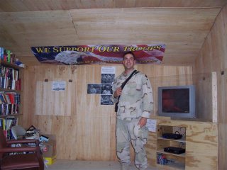
Got this e-mail as a Thank you for the Sign Design gang. According to Lisa at Fralin and Waldron, soldier Ben is back home and safe.
Dear Sign Design Team:
Last year, your company made a banner for my church (Slate Mountain Presbyterian Church). The banner was signed by our church members and sent to one of our own who was stationed in Afghanistan. Attached, please find a picture of Ben and the Sign Design banner. It was hung in their rec. room at the base so that everyone could enjoy it .
Thanks for your great work!
Lisa Mauk
Fralin & Waldron, Inc.
Thursday, January 05, 2006
And We Still Do The Greatest Sandblasted In Town!


Would you take a look at that? That is our proud painter, Lisa, with her latest and greatest work of art. A local Bistro is opening verrrry soon, and they are getting this beautiful sign for their place...
What a blast it was to make. Sandblasted 2" high-density urethane (it's 2-sided, by the way and looks just as cool on the other side), with hand-painted graphics, a hand-carved additional "globe" with "Trio" blasted into it and smaltz applied. The line of copy Bistro Bar Bottle is 1/2" black acrylic mounted with studs.
It's a fine piece of work! If you'd like something amazing for your own place, give us a call!
Wednesday, January 04, 2006
Full-Color Mimaki JV3 Solvent Inkjet Printer

Sign Design has purchased and is now running "full-tilt boogie" a Mimaki JV3 Solvent Inkjet Printer!
What does that mean for our customers?
We now have the capability to print photo-quality graphics on banners, vehicles, plywood signs, aluminum signs--the possibilities are practically limitless! These signs are not as long-lasting as vinyl, but they are a lot snazzier! The prints have a three-year outdoor durability with no lamination. The maximum resolution is 720x720 dpi (which for you non-techies means "it looks good!")
Although the Mimaki only rints panels up to five-feet wide, larger prints and banners can be produced with the use of tiling.
Tuesday, October 04, 2005
Full color print on signs
Is the life of the regular ground based sign still only 5 yrs due to the color printed on vinyl?
Answer:
It is simply the outdoor durability of the printed graphics, i.e. "photos". If aluminum is the substrate, the aluminum will last 10 plus years (I'm talking about the paint on the aluminum) The aluminum itself will last until a tornado blows it away.
A sign would be constructed using aluminum and it is painted with automotive enamels. But the printed graphics will begin to fade after some time.
We have been producing "full color" graphics for some time. The first process we used was called "wax thermal transfer" where spools of color were passed over a print head in the machine and the colors were fused to the vinyl. We are still using this process, but we are also printing with an inkjet machine which uses solvent based inks. These will not "wash-off" the sign and are unaffected by moisture, but they will degrade over time with UV light. By adding a "UV" lamination over the graphics we can get 5 years durability and life. This is the same for any print process I know of presently. If anyone tells you otherwise, I would get the name of the process and get some clarifications- because it does not exist.
Thanks,
Al Willamson
Footnote:
The entire graphic world has gone crazy over digital printing and all of the neat "special effects" that can be produced. The only problem is that none of the designers (except us) are trying to relay to the end user that all those special effects come at a cost. Certain indoor graphics could not be done without a real artist and full-color print. These things have their place.
Our job is to continue to tell our customer WE CAN PRODUCE FULL-COLOR GRAPHICS, but let them know what we suggest and what is currently available along with the expected outdoor life.
Until someone comes up with 15 year inks- nothing can take the place of well constructed signs with tasteful lettering in vinyl with some white space.


